Facebook Pixel
Skip to main content
Norwich University of the Arts
  • View work from the Acting course
    View work from the Animation course
    View work from the Animation and Visual Effects course
    View work from the Architecture course
    View work from the Design for Publishing course
    View work from the Fashion course
    View work from the Fashion Communication and Promotion course
    View work from the Fashion Marketing and Business course
    View work from the Film and Moving Image Production course
    View work from the Fine Art course
    View work from the Games Art and Design course
    View work from the Games Development course
    View work from the Graphic Communication course
    View work from the Graphic Design course
    View work from the Illustration course
    View work from the Interior Design course
    View work from the Photography course
    View work from the Textile Design course
    View work from the User Experience Design course

Joe Gregory

BA (Hons) Graphic Design

The bread prints were made by inking different slices of bread and scanning the print. These were then edited in photoshop into designs for social media with additional text and illustrations.

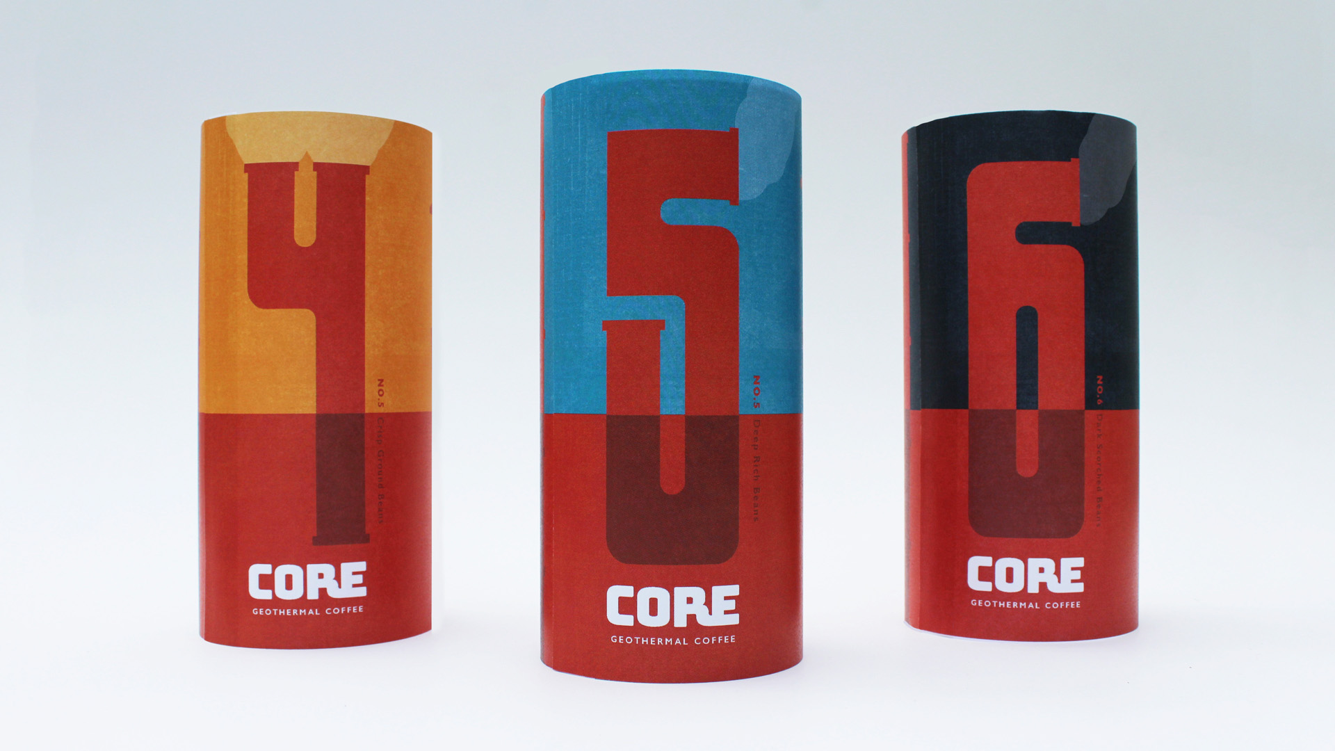
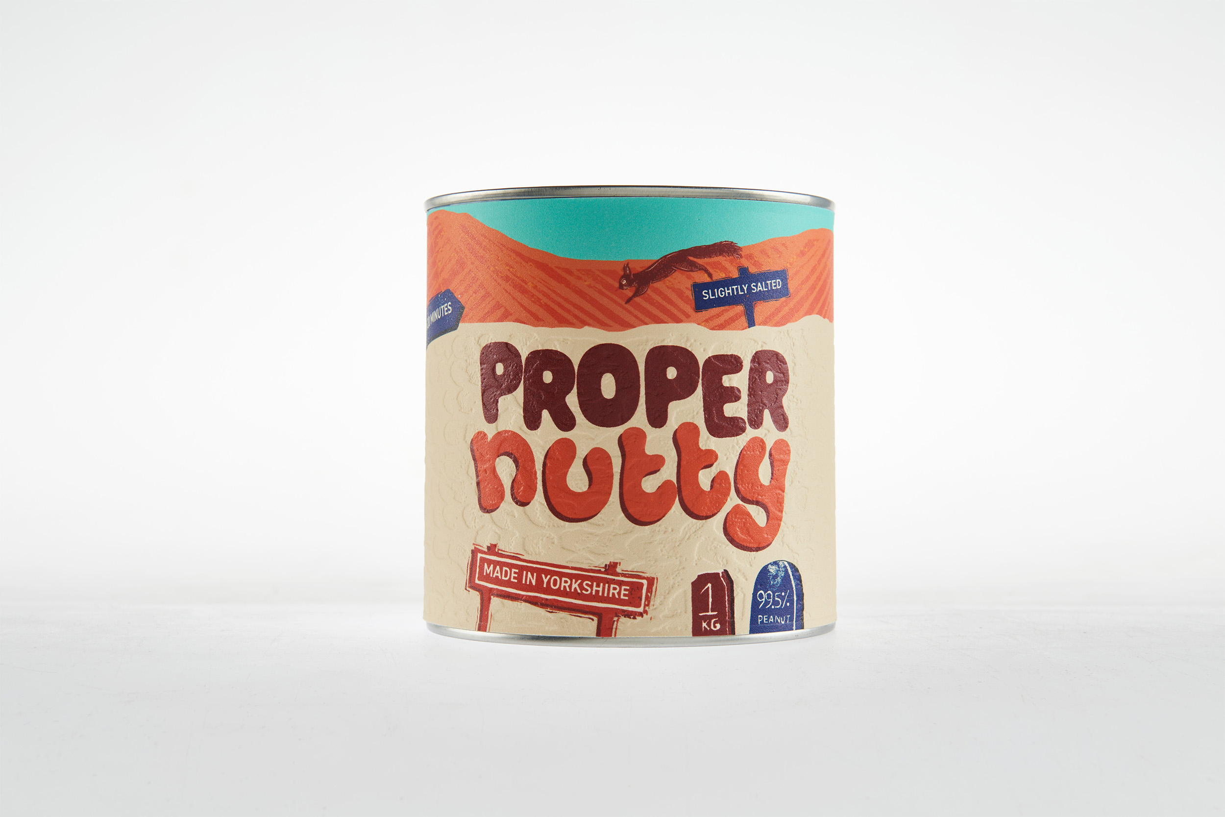
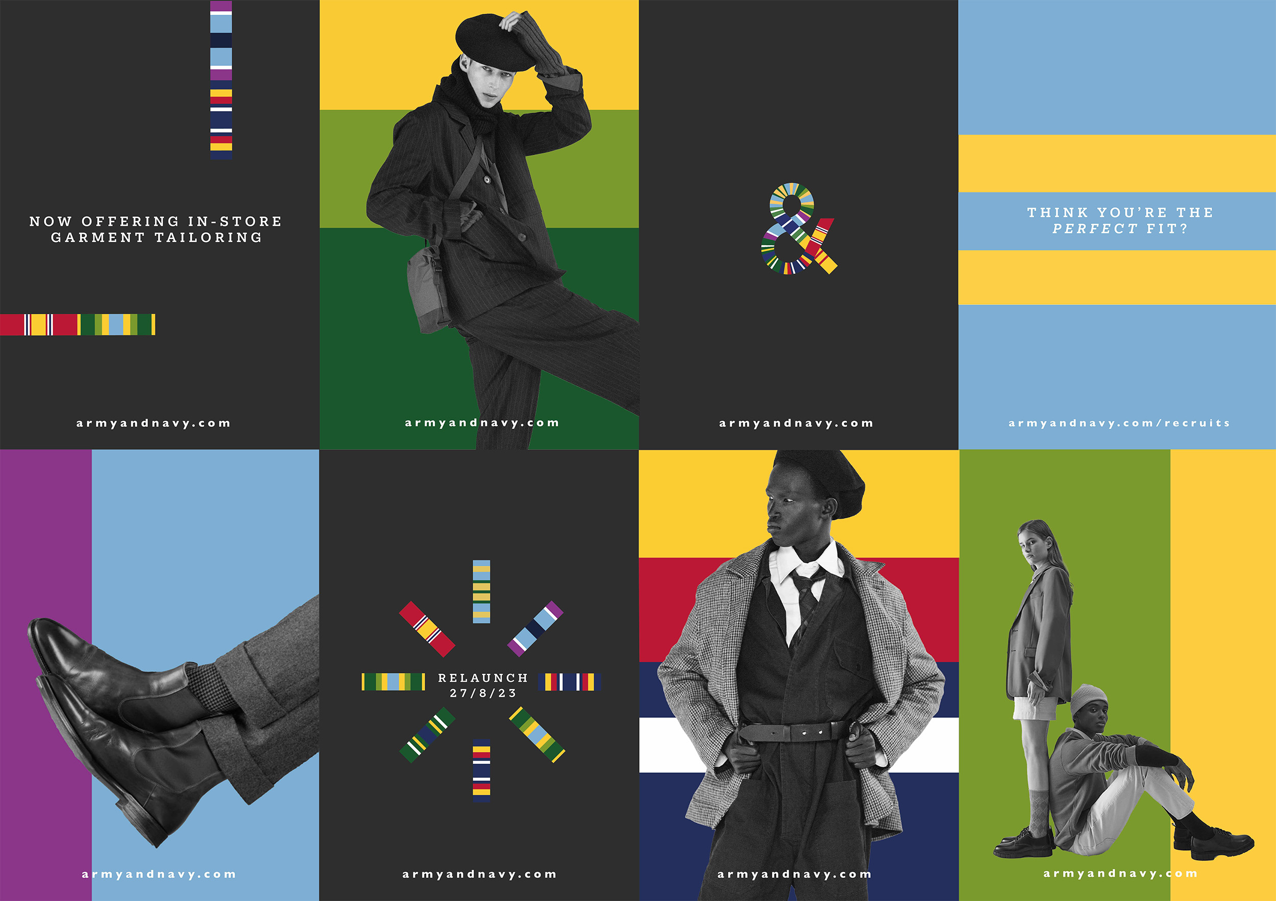
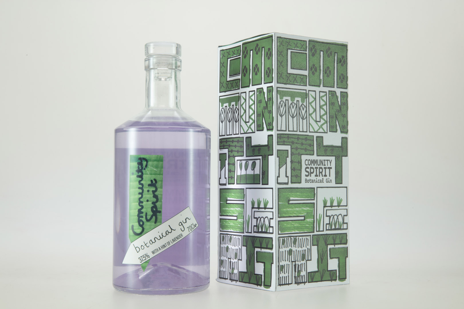
I am a hard-working, multidisciplinary creative with a passion for ideas-driven design. I enjoy being experimental and risk-taking with my work, often developing my ideas using Adobe software, as well as taking a hands-on approach. I believe an effective design should communicate an idea in a simple, yet impactful way.

Heineken will conceal the star from their packaging, which will reveal in the dark. They will also black out billboards across the world, raising awareness of light pollution.
Open and view content in lightbox
D&AD wood pencil

Through tackling a range of industry-set briefs at university, I have gained a range of valuable skills, including research, problem-solving, collaboration and presenting my ideas. I’m excited to apply my skills in industry and to do more of what I love.

Photograph of packaging identity on product. The identity uses a condensed serif typeface to subtly reference the geothermal pipes underground.
Award Winner Badge
Proper nutty design mocked onto product tin. We debossed peanut prints onto the tin to create a drystone wall, which is characteristic of Yorkshire countryside.
The identity takes inspiration from the colourful ribbons found on military uniform.
  • Branding
  • Graphic design
  • Illustration
  • Packaging design
  • Visual identity
  • Arrange a video call with Joe (Opens in your email client)
  • Email Joe (Opens in your email client)
  • More work from Joe (Opens PDF in new tab)
  • View Joe's Website (Opens in new tab)

View more students

  • Dan
    De'ath

  • Bethany
    Hansford

Back to the Course Page